Richness in simplicity.
Gordon Inc.
Website design
Identity
Branding
Concept
Design
Art Direction
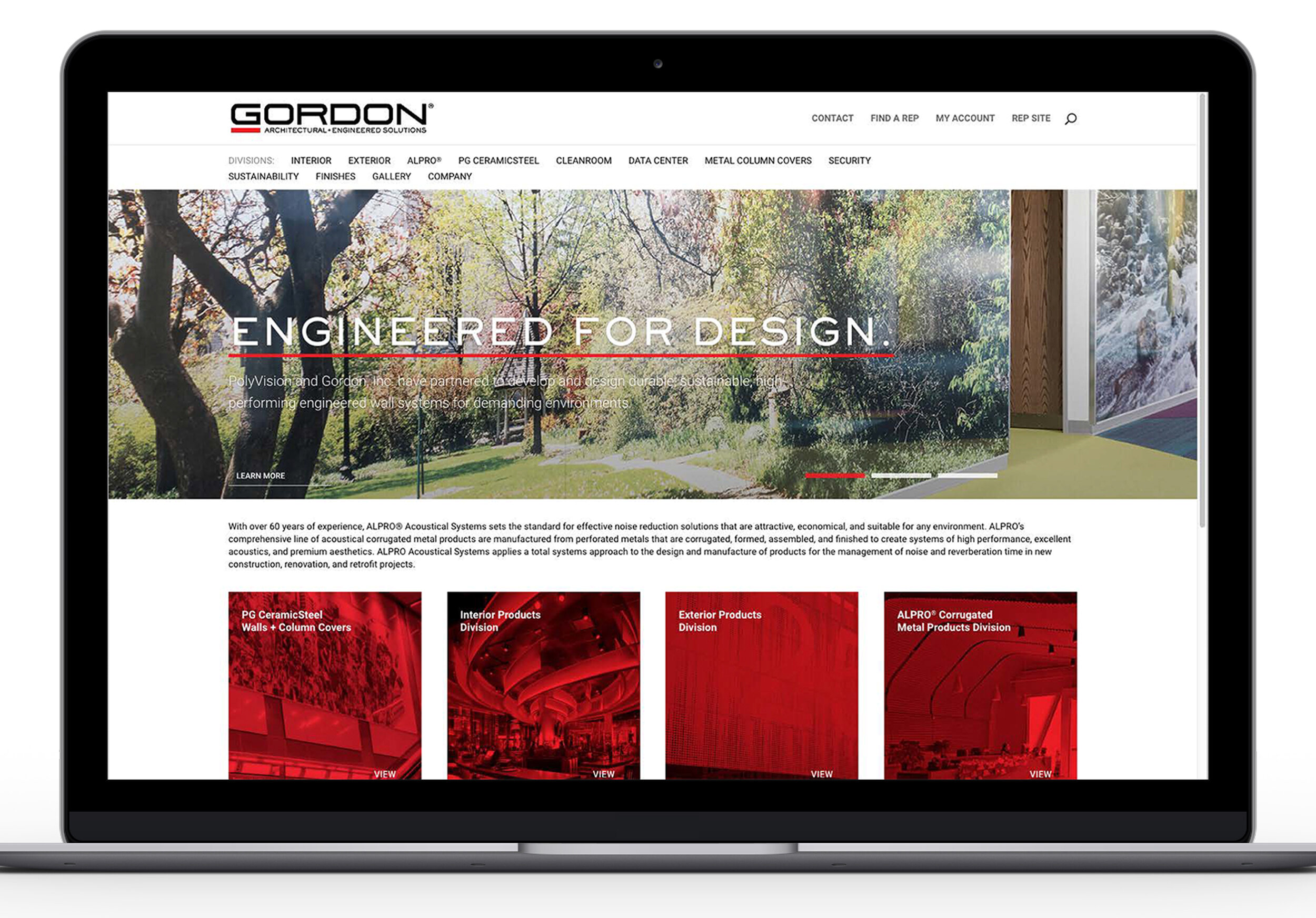
In a sea of data-heavy and information-rich product offerings, simplicity is gold.
With a ton of information to go into this website re-design, we needed a complete overhaul of the organization and presentation, in addition to an audit of the user experience.

User research showed that the audience needed a more organized and clear experience. We tightened up product categorization and page titles, and consolidated it all into one highly visible and informative navigation.


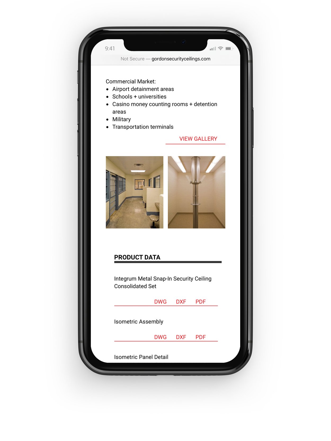
Likewise, our simple typography is highly effective in distinguishing each type of content, and keeping the layout clean for desktop and mobile.


This re-design was part of a complete branding effort, and included a similarly concise presentation of product data in sales brochures and technical sheets in addition to identity.
