branding is a kind of cartography.
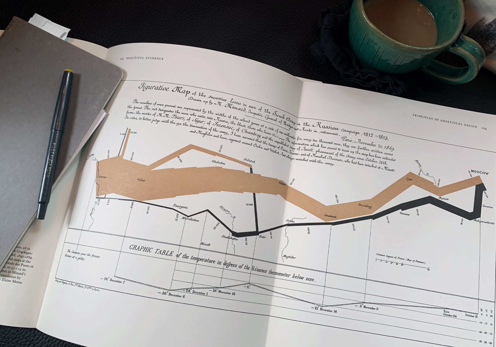
I went to a one-day course taught by Edward Tufte a few years ago in Austin, Texas. Tasty craft beer, damn fine barbeque, and “Presenting Data and Information” – a pretty perfect holiday, if you ask me. In that course I discovered an image that I continue to go back to time after time: Charles Joseph Minard’s map of Napoleon’s march to Moscow in 1812.
I keep this image in my mind when thinking through any brand project for two reasons.
1- It tells the story immediately, succinctly, and beautifully.
2- It presents multiple dimensions of data in a single image.
I’ve always loved maps, charts, diagrams. When I read Tolkein for the first time, I was completely enthralled with the map of Middlearth. It wholly fascinated me. Martin’s Westros map does the same. As an avid reader, accomplished imaginator (yes, I made that up) and someone with a heightened visual sense, those maps reflect the culture of the inhabitants just as much as the topography of the land.
“The ultimate test of your knowledge is your ability to convey it to another.”
This is what branding does. It communicates the inside, the outside, the systems that make your company or product function, and the reasons for your existence. All at once. So to say it needs to be easy to understand is, as I’m sure you can guess, an understatement.
Now, that’s not to say your brand needs to be mystical, connecting with your audience on a psychic level or any of that woo-woo business. That’s better for other things. Rather, a brand needs to be concise and honest.
And this is what I do. I help you to distill the core of what your brand is and needs to be, then I bring its visual voice to life. I’m a cartographer. I’m a brand designer.

